The new line of Michael Harding watercolours is over 20 years in the making and it’s finally here. I had the opportunity to try 24 colours out of the 136-colour range to find out what these new paints have to offer. Here are my first impressions.
Michael Harding Watercolours – The Colour Range
With 136 individual shades, this new line is larger than the oil range which numbers around 100 colours. There are some familiar colours from the oil range– for example Italian Green Umber, a beautiful and characteristic green earth from the oil range, is also available as a watercolour (albeit made with different pigments). There is also a genuine Lapis Lazuli in the watercolour line, which is one of the most special colours in the oil range. However, there are many new watercolours that are unique to the range and I’m sure oil painters will be wondering if some of them will become available as an oil paint!
The Consistency of Michael Harding Watercolours
All brands of tubed watercolours vary in consistency and watercolourists have their own preferences. Some paints are long and sticky, while others are shorter in consistency. The Michael Harding Watercolours fall somewhere in between– they aren’t as sticky as, say, Sennelier Watercolours, but they are stickier than Schmincke Horadam. With a few tubes I found that as soon as I unscrewed the cap the colour began to spill out even before I squeezed it. Because of this, I needed to wipe the tube after dispensing the paint in order to avoid the issue of paint drying on the thread. This isn’t necessarily a problem and it’s something I’m happy to do if it means I avoid wasting paint, but it’s not something I need to do for all other brands. This didn’t diminish my enjoyment of the paints, but it’s certainly worth mentioning to artists who are considering them.
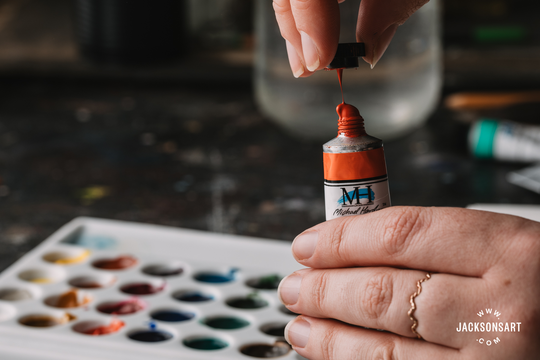
Watercolour paint spilling out of the tube.
The Re-wetting Ability of Michael Harding Watercolours
Whether it’s filling empty pans to take on a painting trip, or coming back to a palette after a couple of days out of the studio, I find it essential that watercolours can be reactivated easily with a brush and water after they have dried. The Michael Harding Watercolours behaved excellently in this regard, and I found them readily responsive after a weekend drying in a palette.

Rewetting Cerulean Blue (PB36) in the palette.
Some Colour Highlights from Michael Harding Watercolours
Here are a few colours I tried that I think are really exceptional:
Raw Sienna Dark
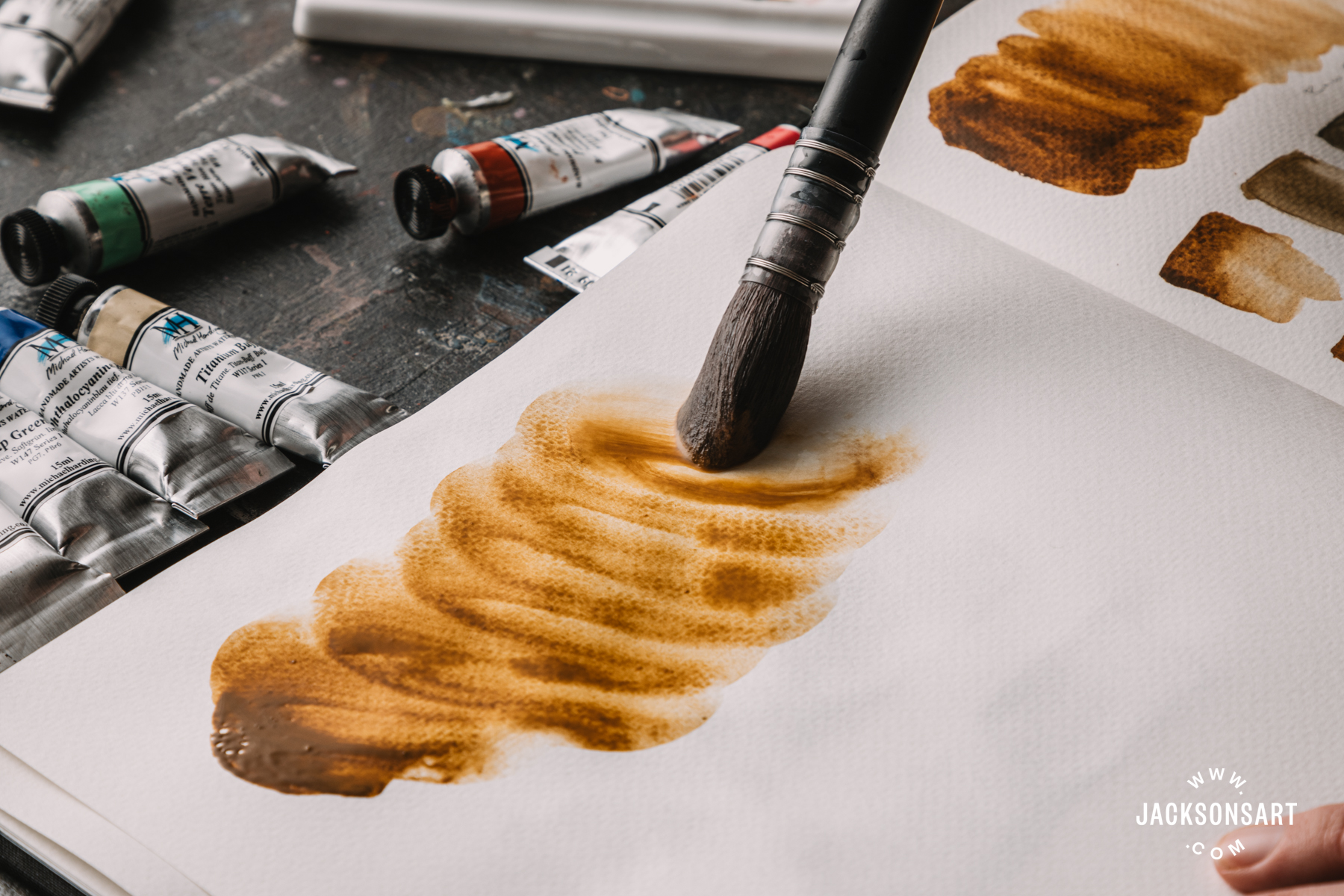
Raw Sienna Dark painted out. Increasing the amount of water in the wash increases its granular effect.
This brown earth has grit and character. It granulates beautifully and is deeper-bellied than standard Raw Siennas. I really enjoyed mixing this with various blues to get a range of natural greens– it’s a lovely colour for a landscape painter and I will certainly be adding it to my palette.
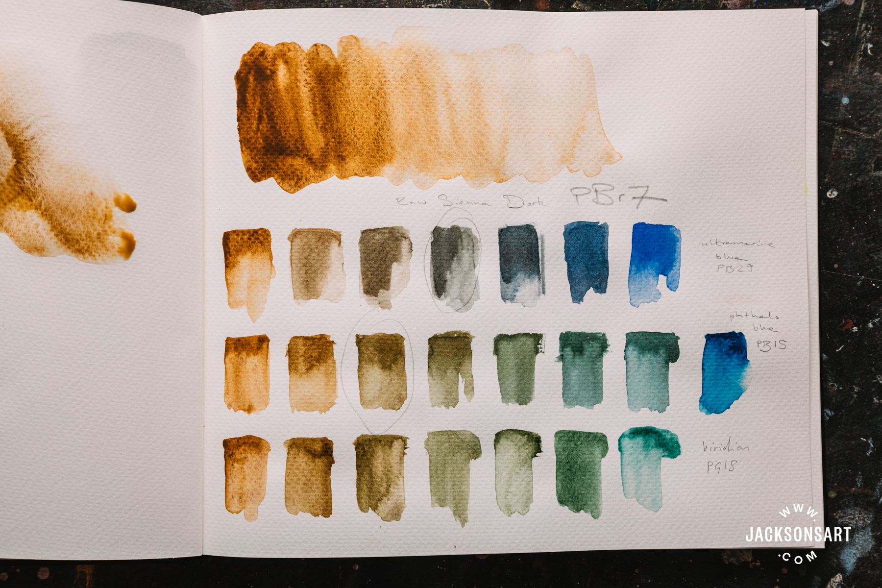
Colour mixtures with Raw Sienna Dark.
Lapis Lazuli
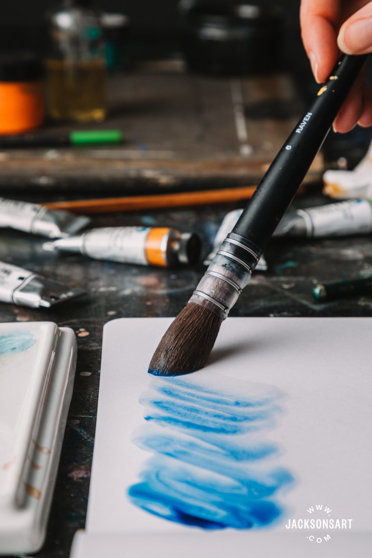
Lapis Lazuli
I had high expectations for this colour because the Michael Harding Lapis Lazuli oil paint is so beautiful. Some Lapis Lazuli watercolours are a pale blue-grey which can be a bit disappointing when you’re expecting the warm and vibrant shade that we find in the paintings of the Old Masters. I’m very happy to say I wasn’t disappointed by this Lapis Lazuli. The expense of this pigment means that you may not want to use it for colour mixing– synthetic Ultramarine Blue is better for this because its stronger in tinting strength, but Lapis Lazuli is a beautifully soft and evocative shade that can make a really special addition to a palette.
Titanium Buff

A velvety wash of Titanium Buff.
Titanium Buff is a variation of Titanium White which is adulterated with a small amount of iron oxide, creating a soft, opaque colour that can range between a sandy-beige and a warm grey. Michael Harding’s iteration is a beautiful example. It’s very granulating, so it adds texture to non-granulating colours. It’s very useful for lowering the chroma of colours in a way that looks more natural than mixing with white. Try combining it with a bright yellow to make a near-green that would be great for picking out highlights in foliage. With Ultramarine Blue it makes a soft, bluish grey.
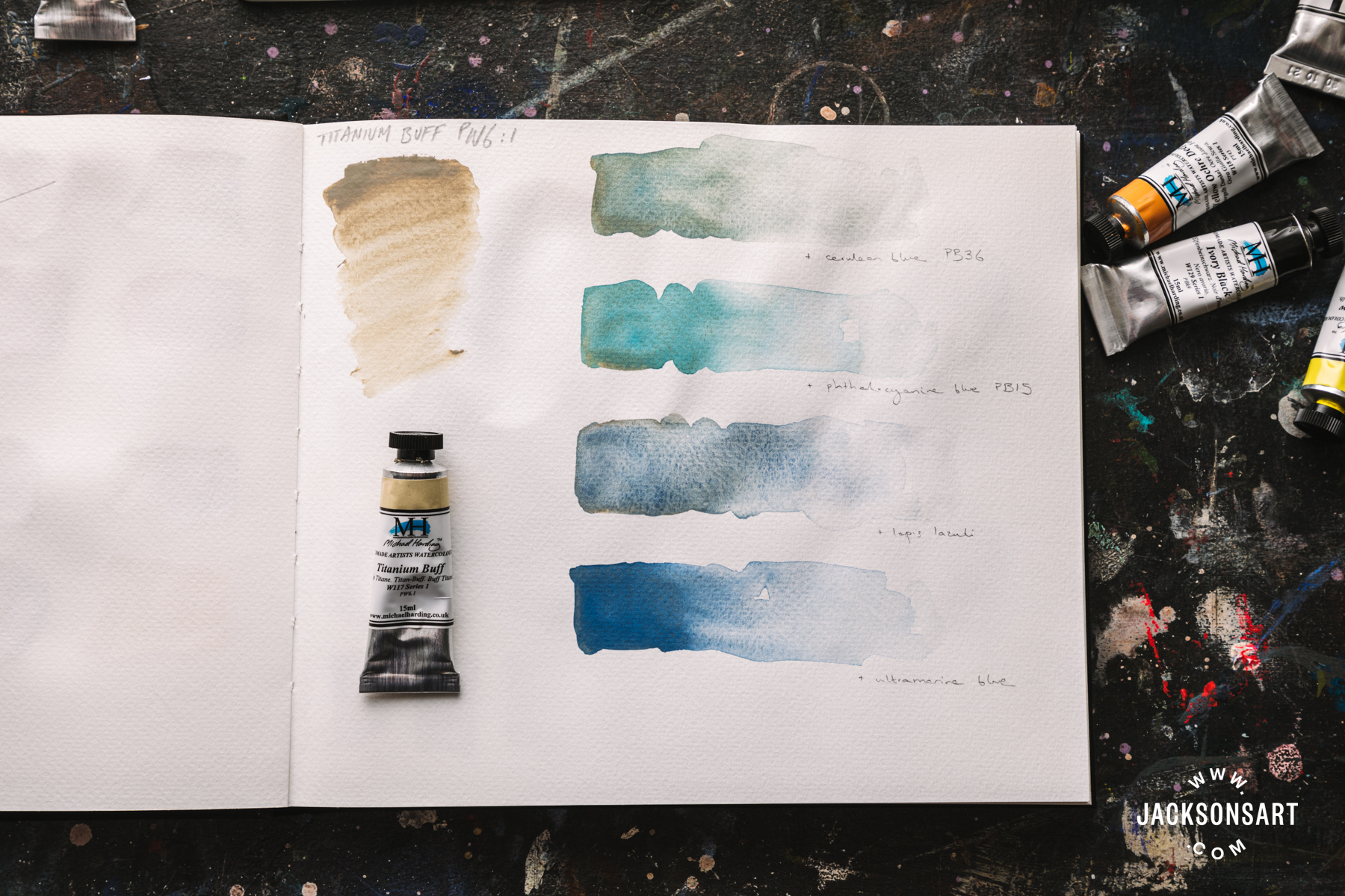
Mixtures with Titanium Buff.
Van Dyke Brown
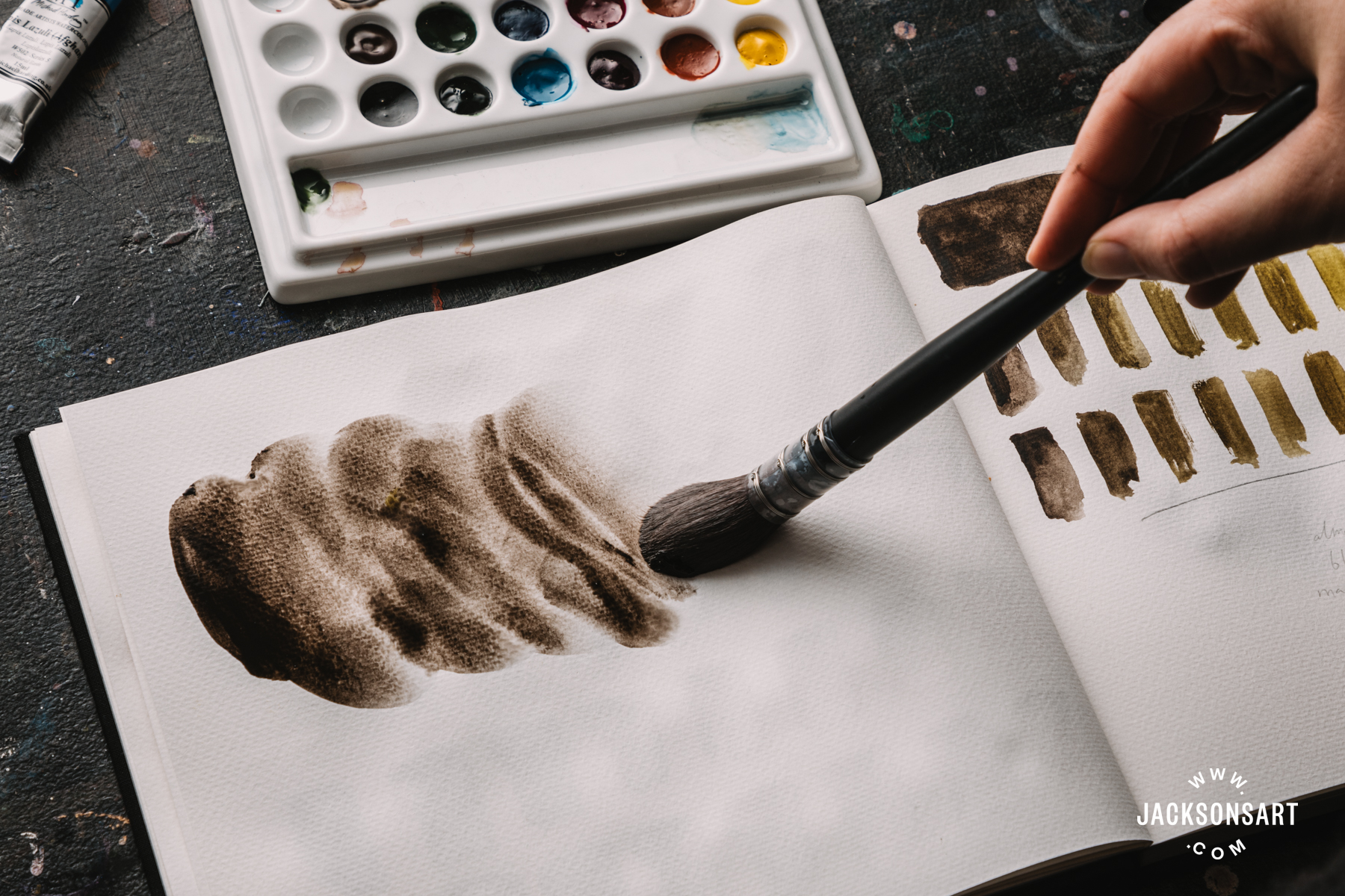
Van Dyke Brown
I was really hoping that this colour would be included among the Michael Harding watercolours, as his Van Dyke Brown oil paint is one of my favourite colours. Van Dyke Brown is a historical pigment named after the artist Anthony van Dyck. In masstone it is black, but it dilutes out to a slightly green-toned brown. What is exceptional about Michael Harding’s version is that it uses single earth pigment PBr8, unlike most ranges which use a mixture of iron oxide and black. This single pigment version is much better for colour mixing, and I loved the range of glowing olive greens it made in mixtures with lemon yellow.
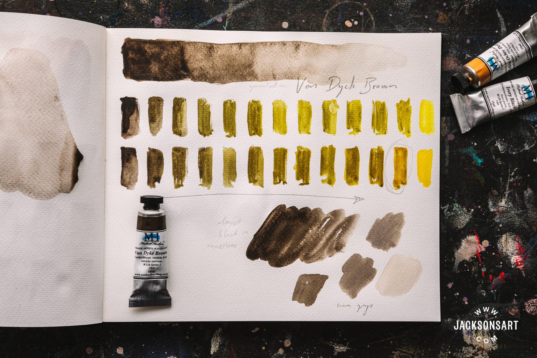
Mixtures with Van Dyke Brown
Although I only tried a small slice of a very large range, every colour I used was a joy to paint with and it seems that the long wait for these watercolours was worth it. With more than 30 years experience in the oil paint market, Michael Harding has proved himself to be a trusted colourman with an extensive knowledge of pigments and how to bring out their particular characteristics. It’s good to see that his move into watercolour promises to offer the same to watercolourists.
Further Reading
In Conversation With Michael Harding
A Guide to Watercolour Painting – What You Need to Get Started
On Location: Michael Harding Handmade Artists Colours
Everything You Need to Know About Watercolour Paper
Shop Michael Harding Watercolours on jacksonsart.com


More Stories
Body Piercing – The Healing Process and Aftercare
Different Types of Body Art
Penis Pearling: Permanent Penis Pleasure or Painful Penile Mishap?